Mona Foma. An arts and music festival like no other. Set across Launceston and nipaluna / Hobart over a glowing fortnight in February, artists and musos come from all over the world to create magic in the height of our fleetingly intense Tassie summer. To share in a collective experience at a specific moment on this plane of reality. To lose your SELF. And return to reality a little bit different.
We’ve taken cues from Carl Jung’s Red Book, the pioneering abstract art of Hilma af Klint and 1970s mindfulness propaganda to create a self-deprecating, woo-woo summer identity centred around the photographic portraits of six diverse Tasmanians.
In 2023, the double-circle motif is brought into the physical realm as expressive makeup around the eyes of our six protagonists.
This imagery is complemented by a suite of otherworldly closeups of irises, evoking a world within. This, coupled with esoteric headlines like ‘Tired of being a human?’ builds a brand that plays with the idea of consciousness and your own journey of festival enlightenment.
We paired clean-edged typefaces with handwritten headlines. In fact, a whole lot was crafted by hand: layers of collaged textures, sketches and squiggles in pencil and paint all combined to create an analogue extravaganza for the eyes.
Founded by a fiercely independent female winemaker, T’Gallant’s most distinctive quality is its style: its idiosyncratic grapes, the renegade techniques to mature them, and its owner’s personality. The winery is a famous destination on the Mornington Peninsula, and is visited by a coterie of devout, mostly female followers.
The brief was a brand overhaul: new tagline, a new vision for the wine, a new era.
The world of wine, like perfume or art, is rich with romance and nuance. How, then, was the best way to re-launch T’Gallant?
Dance is the perfect medium to express strength, beauty and freedom. I cultivated a tone and script that embraces these qualities and offers a call-to-arms for the T’Gallant consumer to feel free to be.
Script:
Come out, come out,
whoever you are.
Come brazen, come bashful,
Come without labels or constructs.
Come out of the shadows
and into the light.
Come out of your shell.
Come undone.
Come unstitched.
Come unburdened, unbridled.
Come from the earth,
or return to it.
Come as you are,
for you are exactly who
you need to be.
T’Gallant. Free to be.
My role: Writer, art director, designer.
The Mona Shop needed a stupid, attention-seeking product to flog that not only builds the Mona brand (sex and/or death) but makes DW a lil’ coin.
What could be more stupid and attention-seeking than our own brand of condoms for fucking the art world. These anti-pretentiousness prophylactics come in five varieties: “artist”, curator, critic, collector and valuer—so now you and your art-world-trolling friends can fuck back (safely).
We shot these dingers as if they were a premo art-world product: cool light and a shiny, expensive white surface. The aim was to present these dingers like the premo art-world product they were taking the piss out of: a super sleek, Jeff Koons balloon dog.
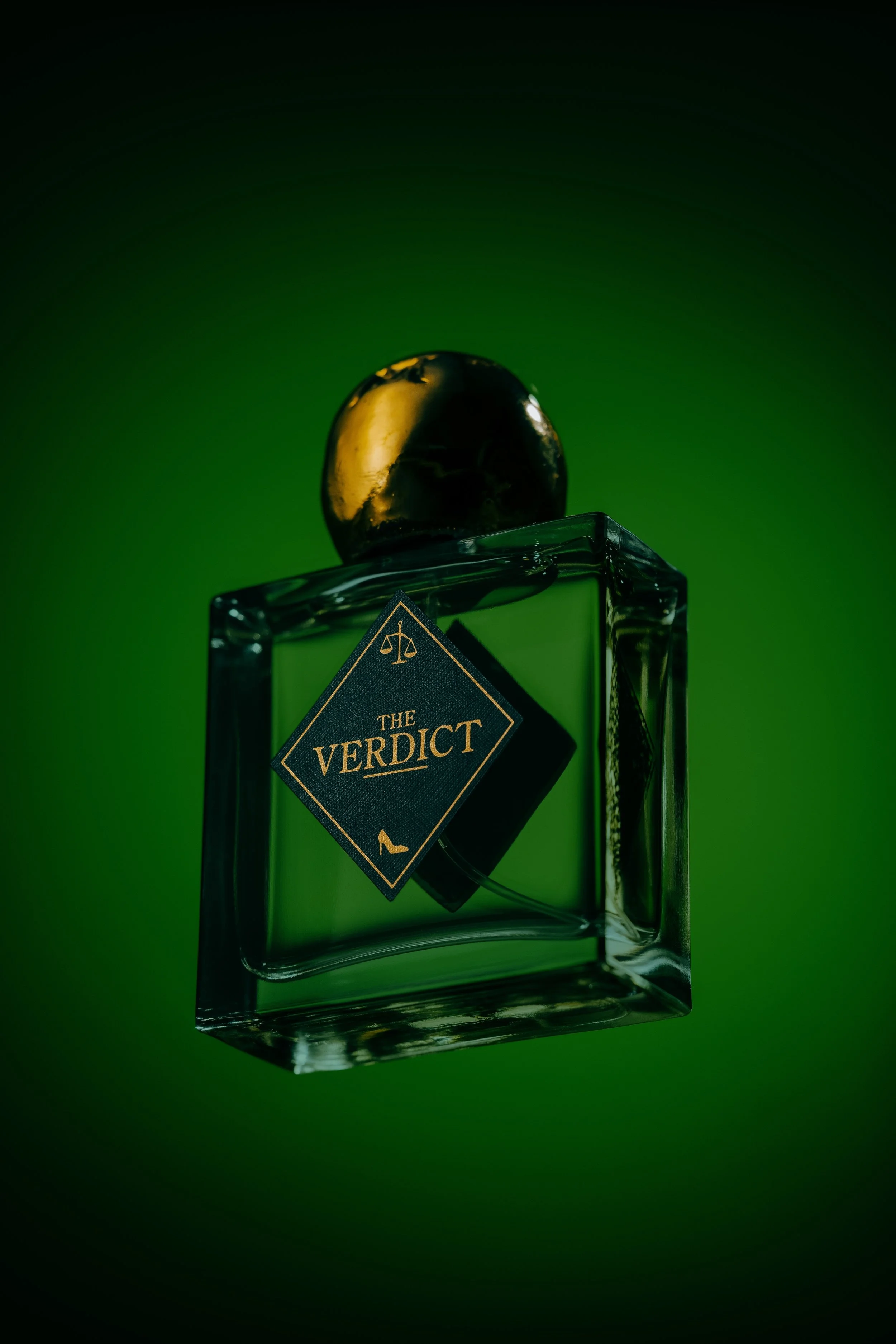
In case you missed it, Mona got in to some hot water in 2024. And by Mona, I mean KK, the wife of Mona-owning David Walsh. Her installation, The Ladies Lounge, is an experience for people who identify as women—strictly no men allowed. Then a man sued KK and Mona for discrimination because he wasn’t allowed to participate in the artwork. But he lost (hehe!)—and to mark the re-opening of The Ladies Lounge, we launched a perfume.
Role: Design, Art Direction
Bonds is one of Australia's most iconic fashion brands. The brief tasked us to shake things up and reposition Bonds as an edgy, cool, fashionable brand that millennials will continue to flock to.
This campaign needed more than just a bunch of coat-hangers and a great product. For this to work, we needed to craft characters and evoke a lasting attitude that would make the product jump off the screen.
I set about building a tone that was all about being at ease in your own skin. It doesn’t matter who you are, who you love, how you cut your hair: Bonds Sweats are for those who are comfortable AF.
We cast an unexpected bunch of kids, kept re-touching to a minimum – because flaws are human! – and worked with killer photographer Jo Duck to capture the magic on set.
My role: writer, art director, designer.
Every season, Walshie’s Wine Cult unleashes a new offering of wines from Mona’s vineyards. The last 12 months have seen us evolve and elevate the branding. We’ve introduced a seasonal colour palette, crafted a mediaeval typeface and distilled our tone of voice to truly express the chaos of a wine cult. We’ve shifted the focus of our worshipful gaze from the world of the cult to the wines of the cult. These subtle distinctions have inspired a boost in wine cult subscriptions and near-cellar-sellouts every season. Praise be.
Every season, Moo Brew stashes some of its infamous stout into barrels and leaves it to age in the dark. Twelve months later, it’s released into the light—a momentous occasion that Moo fans wait all year for.
When people received their limited edition of barrel-aged stout, they performed the ritual of bringing the dark into the light: unwrapping the sheaf of black paper to reveal the stark, white label, and then pouring the legendary black liquid into a glass. Darkness released.
We did something completely different in a category overflowing with dark, blokey labels. We designed a label that’s entirely white, with a subtly embossed texture that satisfies the hands as much as the eyes. The cut-out window in the label’s centre hints at the liquid darkness within—resulting in a product with subversive shelf appeal. And it drew people far and wide.
The Spirit of Tasmania is a ferry operator sailing between Victoria and Tasmania. 'The Spirited Traveller' is a platform we developed to capture the mindset of those who'd rather take their own car, take more time and have a memorable on-board experience.
A combination of brand and frequent retail campaigns gave me the space to cultivate a tone of voice that was at once whimsical, friendly and relatable. We were able to evolve the brand experience to include exploring the hidden gems in Tassie and show off some of the best that the Apple Isle can offer.
Script:
The spirited traveller packs more than a bag.
They journey on four wheels, two or none at all.
They carve their stories on unwritten paths.
And crave the unique and unexplored.
They show their little devilish side or
Hope to find it along the way.
And they know when to unwind
And when to wind it up a gear.
To all the curious ones, we say
Come aboard Spirit of Tasmania.
Be a spirited traveller.
My role: writer, designer, art director
It’s revolution time! Hobart’s second-best revolving restaurant, a.k.a Mona's very own Faro, proudly presents ‘El Culto de España’, or as we say in Tasmanian, ‘El Culto D’spanner’.
If you shut your eyes you could still only be on the Berriedale Riviera...
The Victorian Youth Symphony Orchestra is Australia's longest running community orchestra. A suit who I worked with plays double bass, and she invited me to join the VYSO (I play violin - not very well, mind you!). After a few weeks, we came to the conclusion that VYSO needed a rebrand. So we got a crew together at J. Walter Thompson and overhauled the orchestra's identity. Classical music is cool, so an orchestra has to look cool.
We designed an entirely new look and feel - a minimal design coupled with a hashtagged logo - #RAW VYSO.
Each poster visualises the theme of the concert. From love and heartache to wars, computer games and agent provocateurs. And as soon as we started putting these images around town, classical musicians started to talk. Who was this rogue orchestra?
My role: 2nd violinist, art director, designer, stylist
We went out into the streets on a shocking winter’s day and shot moody portraits of people we approached on the fly. We captured them in the moment—lashed by wind and sleet, numb from cold, barely able to get from A to B. We shot their grimaces on film and added a sepia tone to add some stout-y richness. We’ve taken the negative connotations of an endless winter in Tasmania and subverted them to give punters something to smile about.
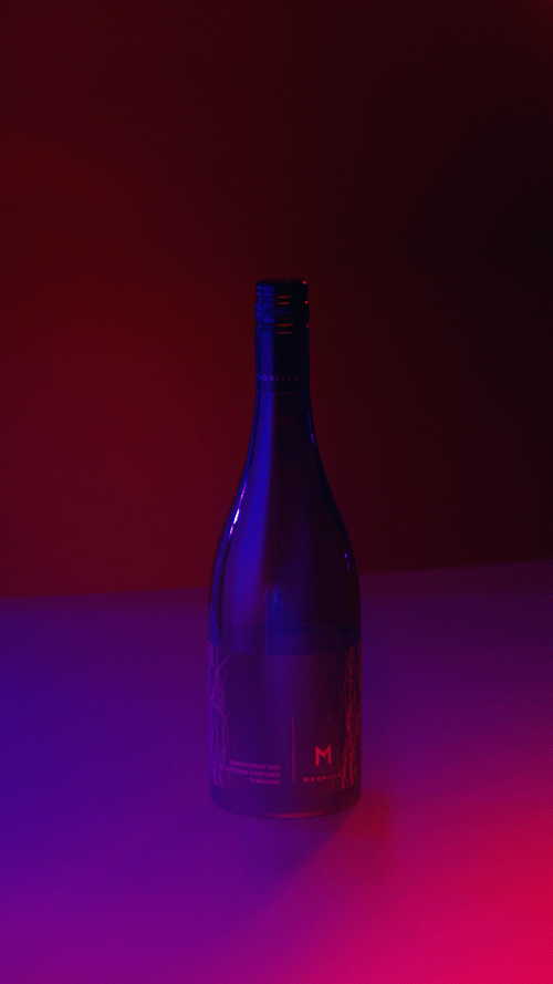
Mona also owns two wineries—Moorilla and Domaine A. This is a selection of some of the content we produce—whether for eDMs, digital campaigns or social. The brands are rooted in heritage, elevated by winemaking craftsmanship and presented as luxury objects to drink now or cellar for something really special in the future. There's also a bit of art thrown in too.
nudie is the only juice brand in Australia that is made entirely from Aussie fruit. And that’s it. No chemicals, no additives - no nasties. Possibly the most playful lines in my book, nudie's inimitable mix of cheek and genuine feel-good appeal helped craft a personality for its new range of Icelandic yoghurt and breakfast smoothies.
My role: writer, designer
D&AD Pencil - 2018 - Melbourne Fringe Festival - Everything is Art
Historically, the Melbourne Fringe Festival has re-invented the wheel every year with its communications theme and design language, making it feel ad hoc and disparate. We created a new brand platform and visual identity Melbourne Fringe could refresh year on year. Everything is Art *for 2.5 weeks talks to the diversity of the Fringe program, while celebrating the festival as an art takeover of Melbourne. The diversity of the festival became the basis for creating a bold design language, allowing for a unifying aesthetic with endless layout possibilities. We then rolled out a campaign for 2017, working with the Fringe performers to capture the energy, curiosity and fun inherent in Melbourne Fringe.
My role: art director, stylist
Bonds released a colourful unisex range for kids - a first for the 100-year-old company. This campaign was all about colour for every kid of all shapes, sizes and creeds. It doesn't matter if you want to wear pink, have short hair or long, you play just as hard as everyone else.
My role: art director, designer, stylist, tone writer
In Australia, it’s really hot at Christmas time. Is there any way we could have a White Christmas, like the rest of the world? Turns out we can – on salt flats and pristine white sand dunes. This is a Bonds Christmas, done the Aussie way.
My role: art director, writer, designer
Below is a selection of point-of-sale editorials for Bonds, which are displayed in store, in out-of-home, and online.
My role: art director, tone writer